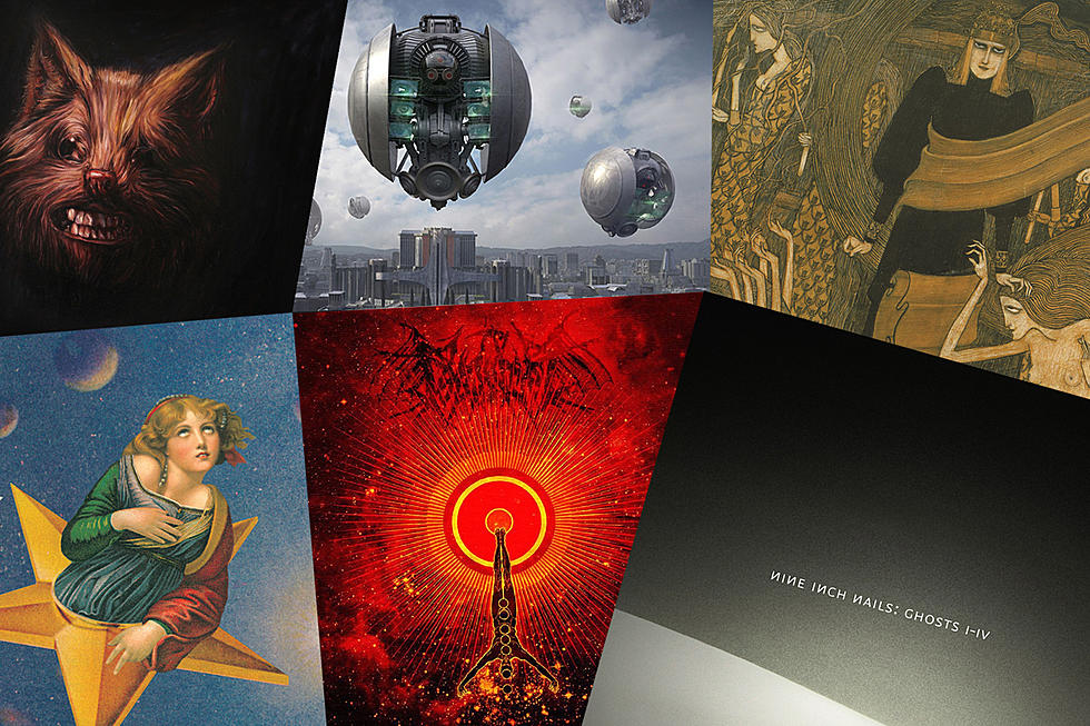
Cover Stories: Smashing Pumpkins, ‘Mellon Collie and the Infinite Sadness’
The best album covers seem straightforward enough but leave a little room for the viewer's imagination. For example, the photo on the cover of Siamese Dream – the 1993 breakthrough by Smashing Pumpkins – portrays two happy little girls, but who are they? Are they sisters? Twins? Conjoined twins?
The Pumpkins' follow-up, 1995's Mellon Collie and the Infinite Sadness, shares that same juxtaposition of straightforward imagery and unanswered questions. A Victorian-era beauty filled with melancholy hurdles through the infinite sadness of space, but who is she? And what exactly is she doing with her hands?
She's the work of John Craig, an illustrator and collage artist who spent more than 40 years in commercial illustration and most of those years were spent freelancing in magazine illustration for the likes of Time, Newsweek and Esquire. But from 1967 to 1970, Craig was a designer and art director for Mercury Records where he created a pair of iconic sleeves for Rod Stewart and others.
Regardless of the client, most of Craig's work has a vintage, retro look – which isn't a coincidence. The artist is drawn to older images that (like many collage artists) he purchases and tucks away in his "morgue," waiting for the right opportunity to use it. When Billy Corgan was making the rounds in search of someone who could turn his rough sketches for Mellon Collie into finished artwork, Craig's agent put the two artists in touch.
The illustrator had never heard Smashing Pumpkins, but at that point, he was 30 years in the business. Suffice to say, working with Corgan wasn't his first rodeo. Craig told NPR: "Billy had such a big idea in mind; he must have had this whole booklet idea already conceived. He really wanted to do Victorian paintings, so after looking at my portfolio, I think he liked what he saw. But [he] still wanted to find someone who could paint in that style."
So Corgan passed on Craig, instead hiring an artist who specialized in painting in a Victorian style. Meanwhile, the band worked with art director Frank Olinsky on what would become the entire Mellon Collie package – the layout of the booklet, the fonts, etc. But when the cover painting was delivered, Corgan (and/or the label and design team) didn't feel it was right, so Olinsky recommended someone he thought could do the job: John Craig.
Although Corgan was still hesitant, Craig eventually persuaded the head Pumpkin to give him a shot at the booklet's internal illustrations. The first collage he put together was the image of two children standing in a poppy field. Corgan liked what he saw and the booklet gig was Craig's.
But the album still didn't have a cover. After the original Victorian-style painting was rejected, the next idea was to use a photo of the band in Victorian finery standing upon a lavishly decorated set. That concept turned out to be cost prohibitive, though, so Craig stepped in. "By that time, Billy seemed happy with the booklet illustrations. So I said, 'Why don't you give me a shot at the cover?' We talked about it... and I looked through a lot of the period books I had and showed him some examples of other people's paintings that related to the celestial idea he was looking for."
The selection of the collage elements was something of a collaboration between Corgan and Craig, who dug through his morgue in search of imagery that might suit the musician's vision. Once they settled on a few things, Craig got to work and assembled the woman on the star.
The image is deceptively simple, as if the artist simply cut out a picture of a woman and plopped it on top of a star. In fact, the woman is composed of figures from two separate paintings manipulated via photocopier until their sizes and shapes fit together perfectly. The head was sourced from an 18th century painting by Jean-Baptiste Greuze entitled "The Souvenir( Fidelity)." Her body was borrowed from Raphael's "St. Catherine of Alexandria."
Both are stunning images on their own, but together, they captured what Craig was after: "With the Greuze, there was something very dreamy or ecstatic about her expression that certainly wasn't in the Raphael painting. And then [there's] the flow and color of the Raphael dress, just the way it's rippling and almost traveling. I guess it's those primary colors too."
The other elements don't share quite the same pedigree: The star upon which the woman soars came from a whiskey ad, and the background first appeared in a children's encyclopedia. Much like musical notes, the individual pieces comprising the cover of Mellon Collie are relatively meaningless on their own – but together, they tell a beautiful story.
What exactly that story may be is partially up to the viewer, and Daoud Tyler-Ameen, who was interviewing Craig for NPR, thought he saw hints of self gratification in the position of the woman's hands. "She may be [masturbating], and maybe only Raphael knows," Craig said. "There's something about the placement of the hands and the whole look this woman has on her face that implies it. I think that's the unspoken eroticism in a lot of that early art. That's all they could get away with."
While Craig retired from commercial work a few years ago, he's hardly retired. Shifting gears toward personal work has allowed him to be "still symbolic, but more mysterious and abstract in content," he told Artspan. In 2012, he mounted a one man show in his home stated of Wisconsin. In fact, you can own your own signed and numbered print of the Mellon Collie cover artwork for a mere $400.
Worst to First: Every Smashing Pumpkins Album Ranked
More From 94.1 KRNA


